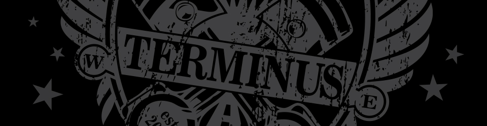
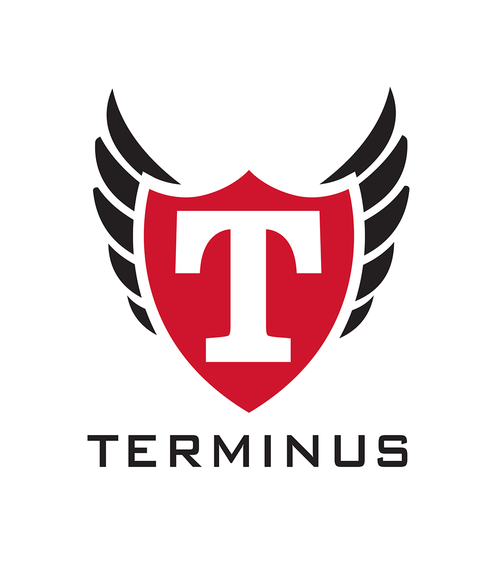
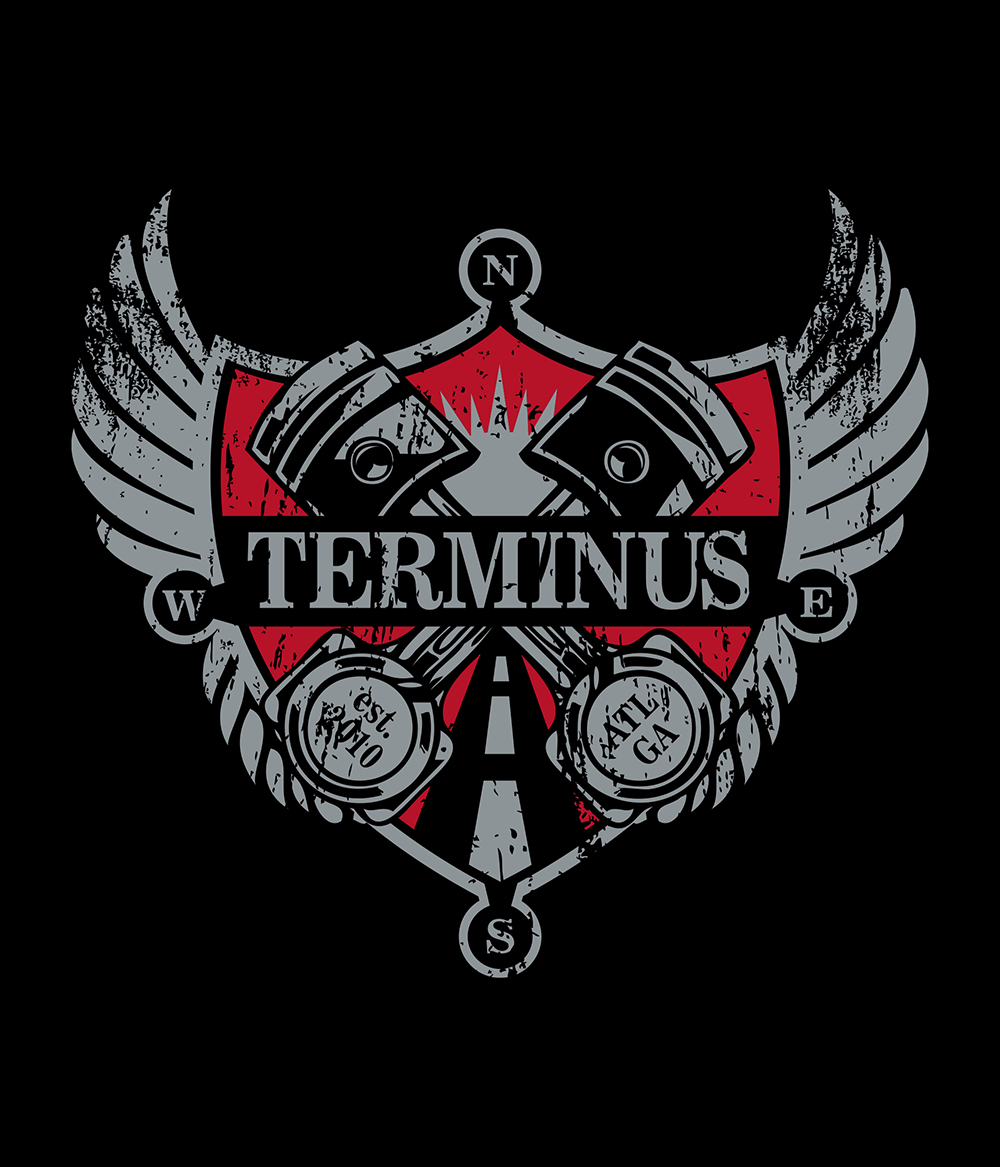
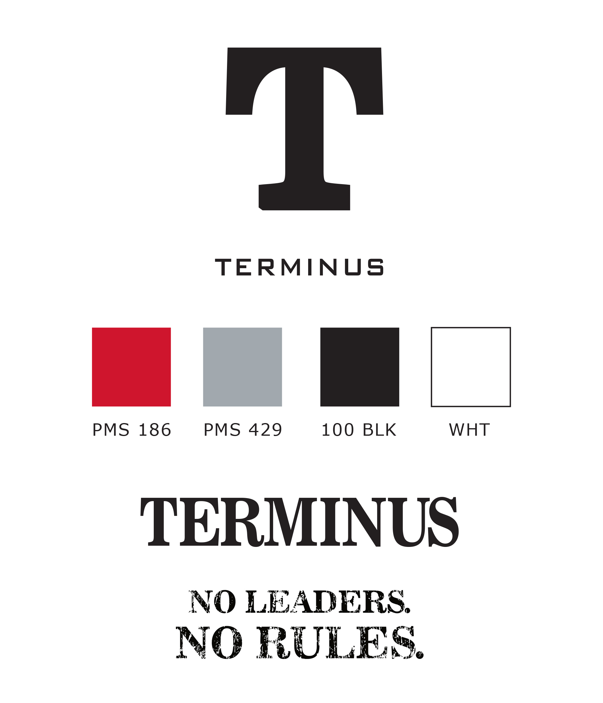
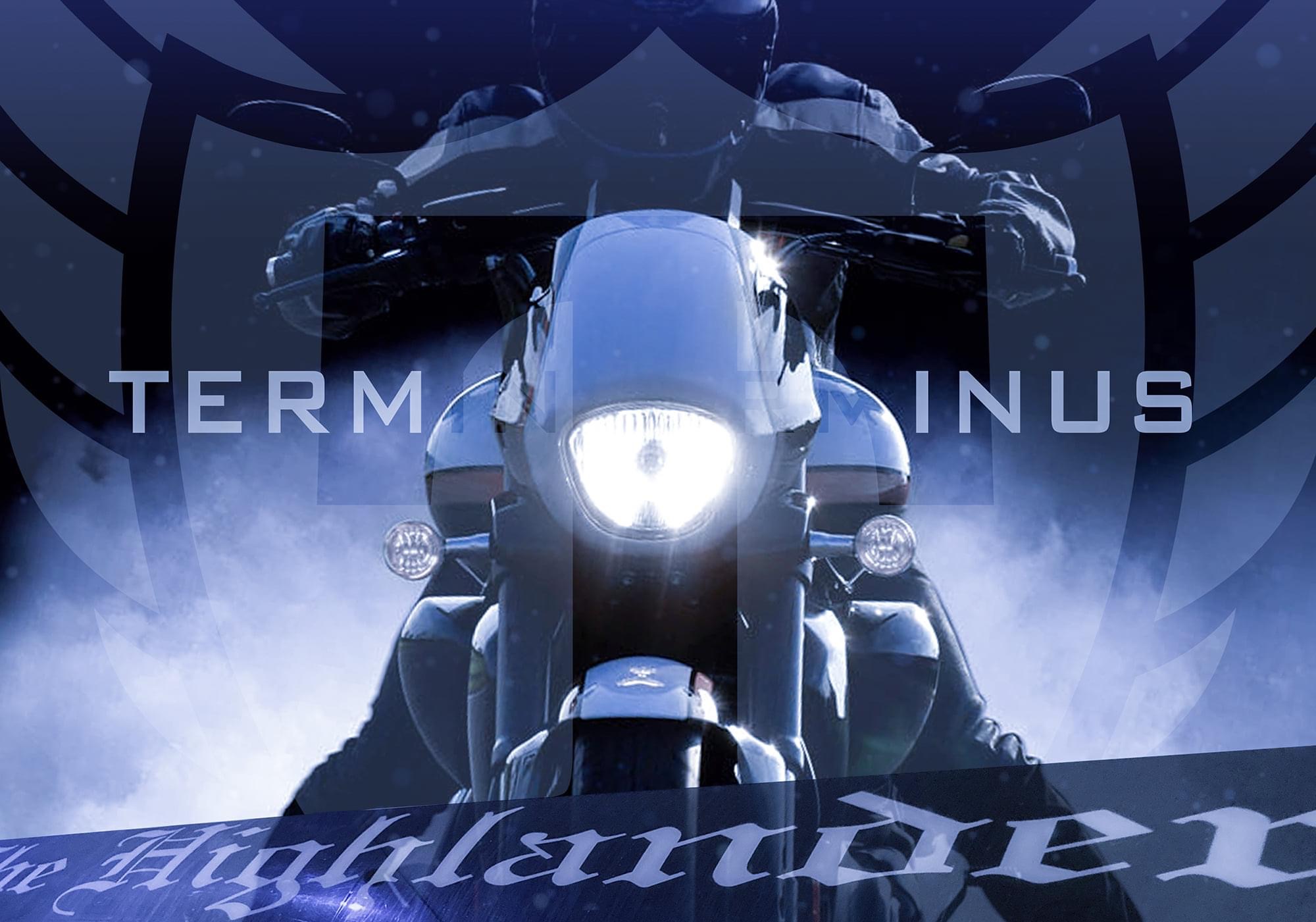
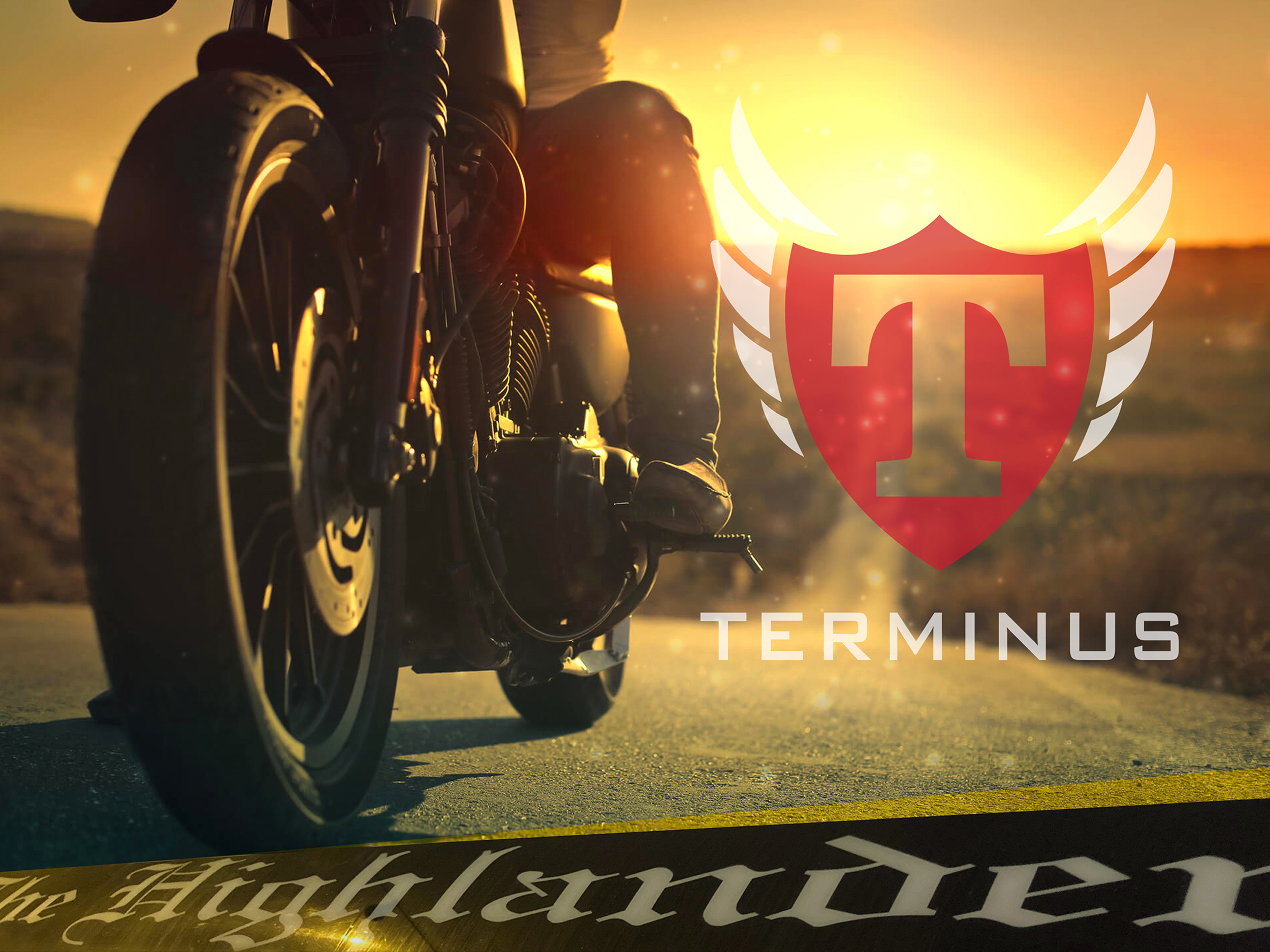
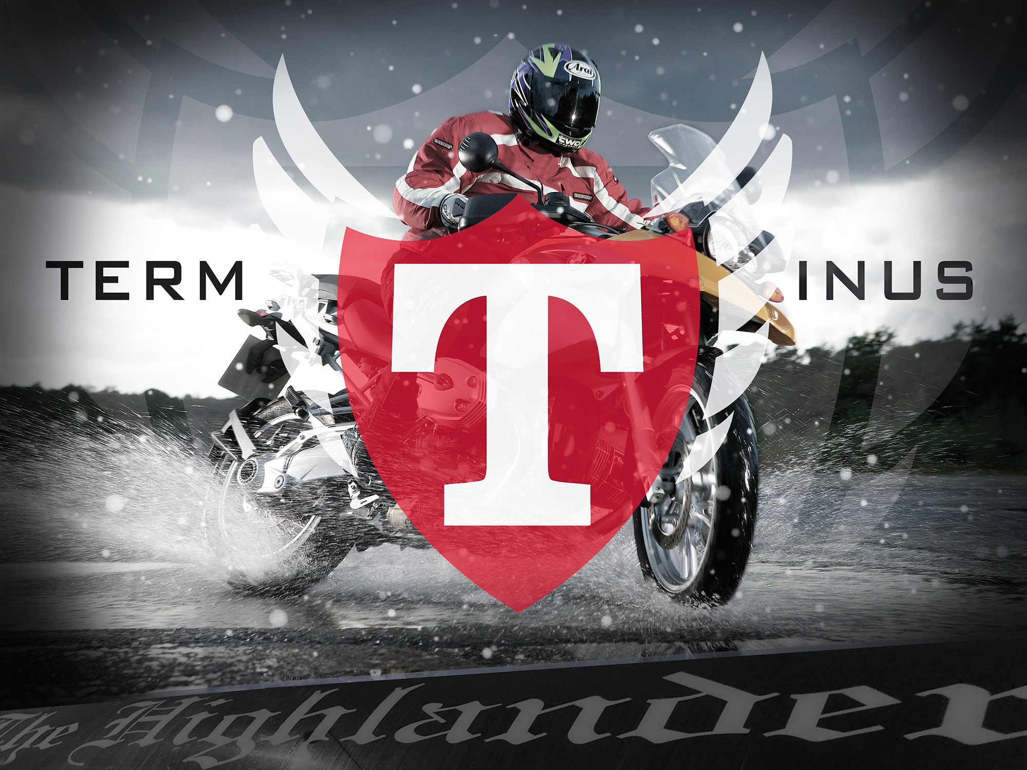
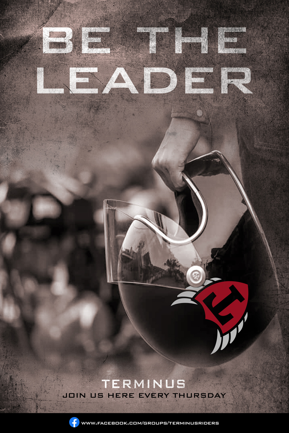
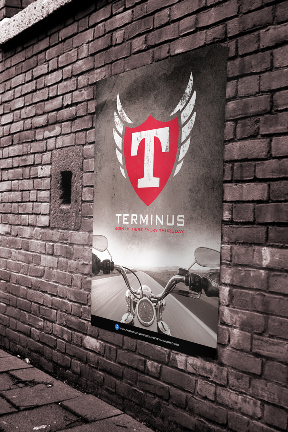
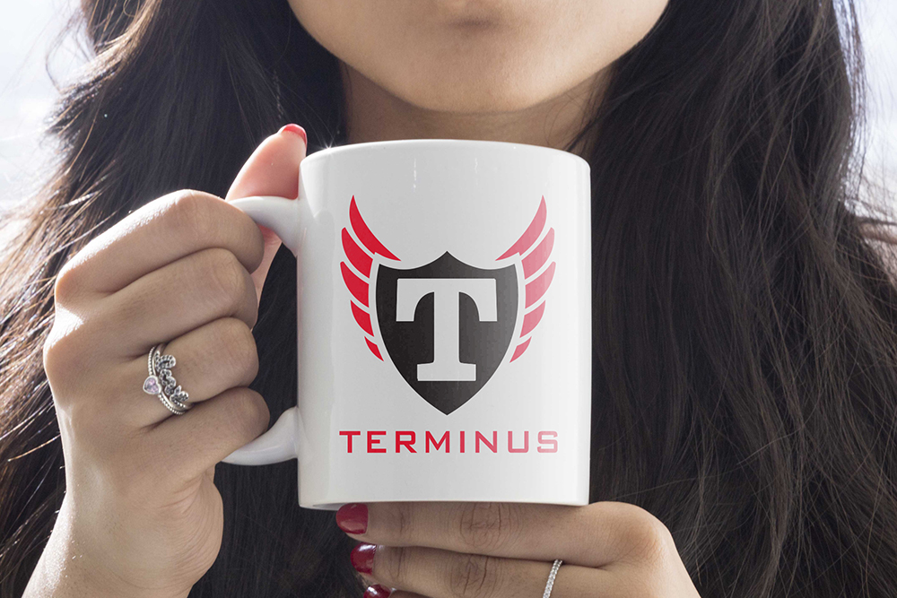
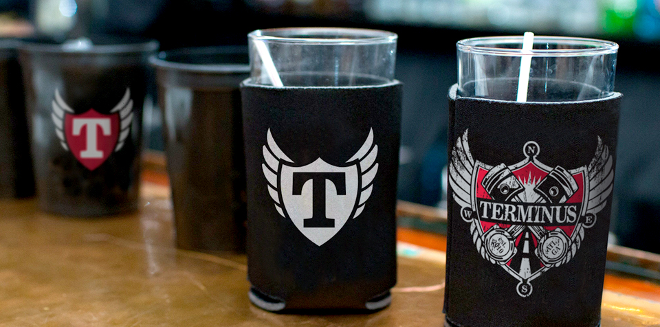
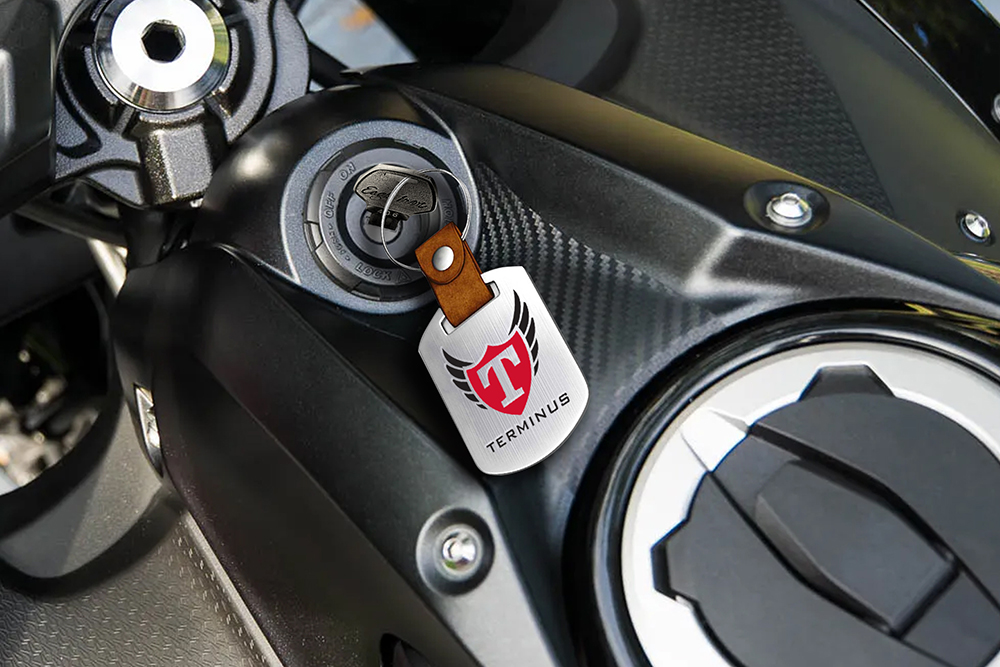
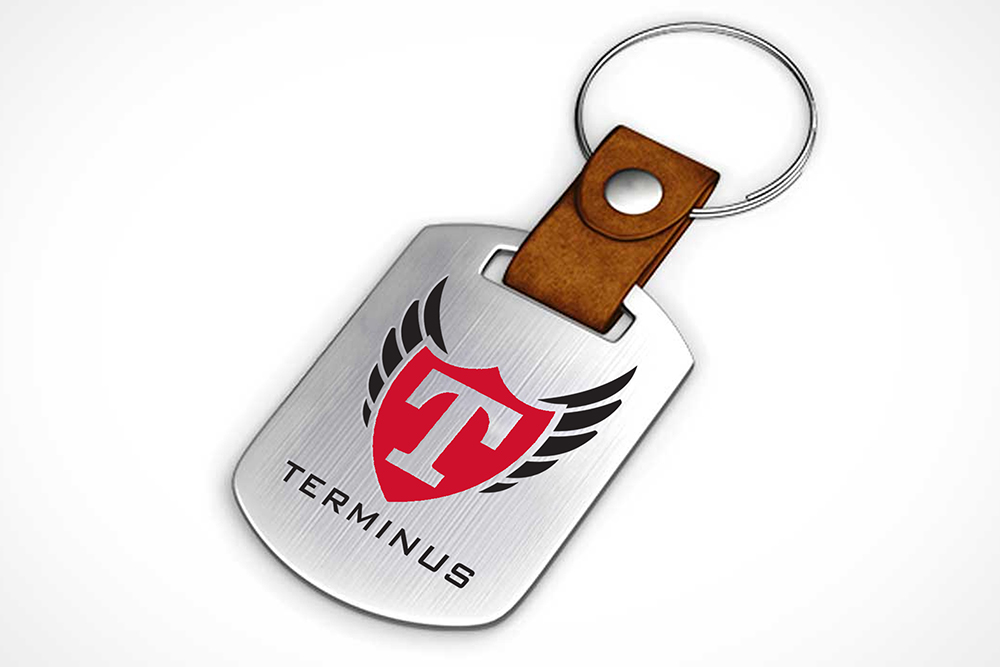
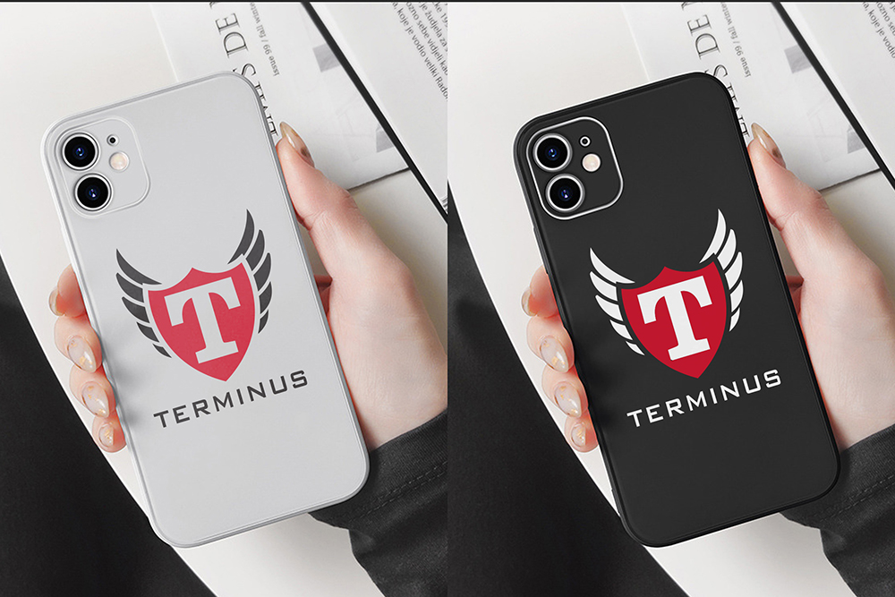
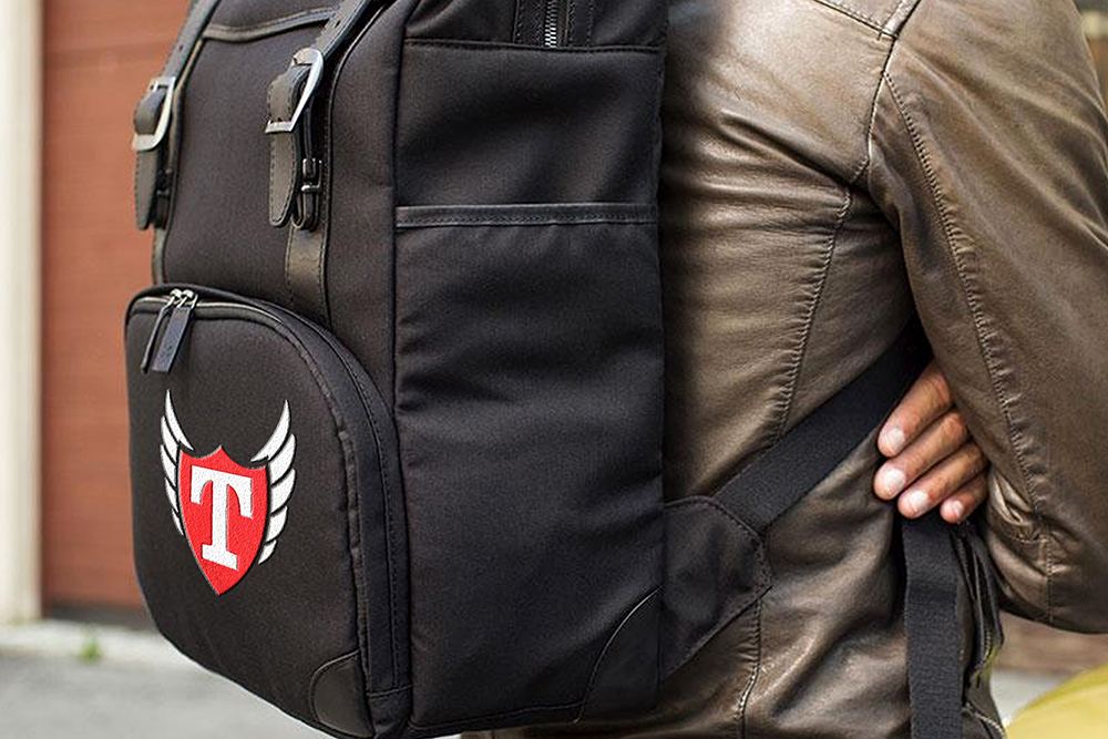
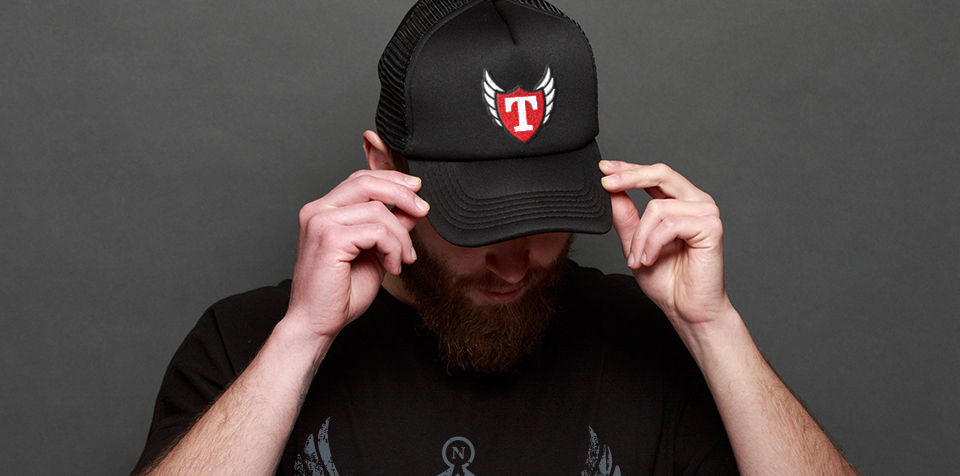
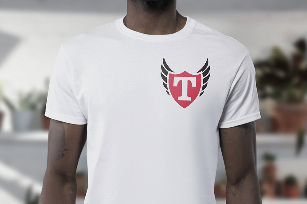
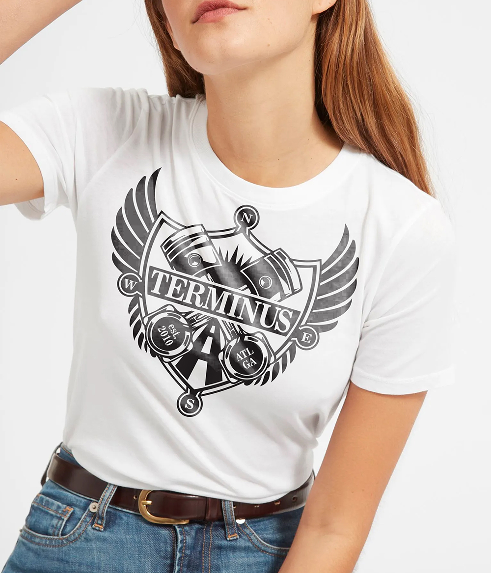
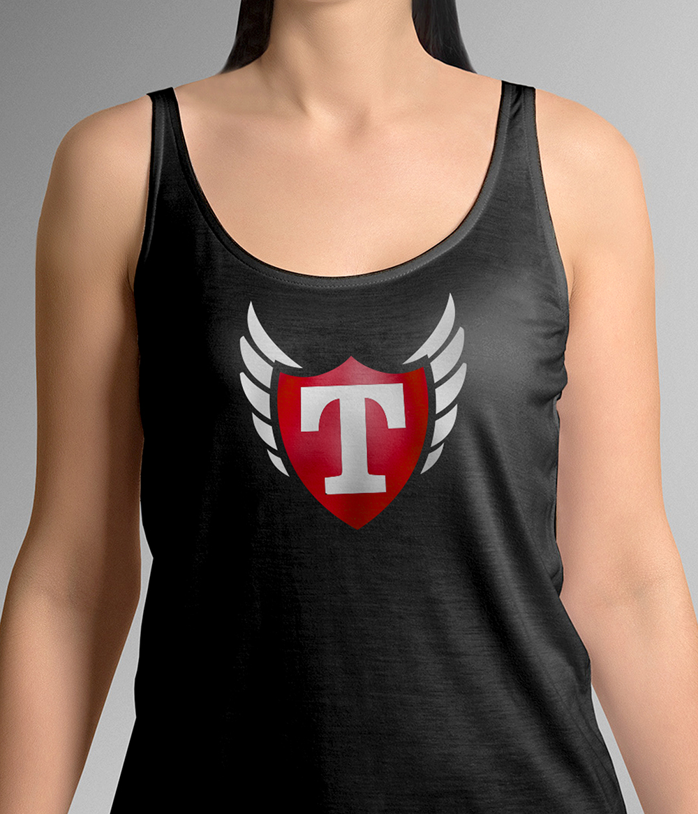
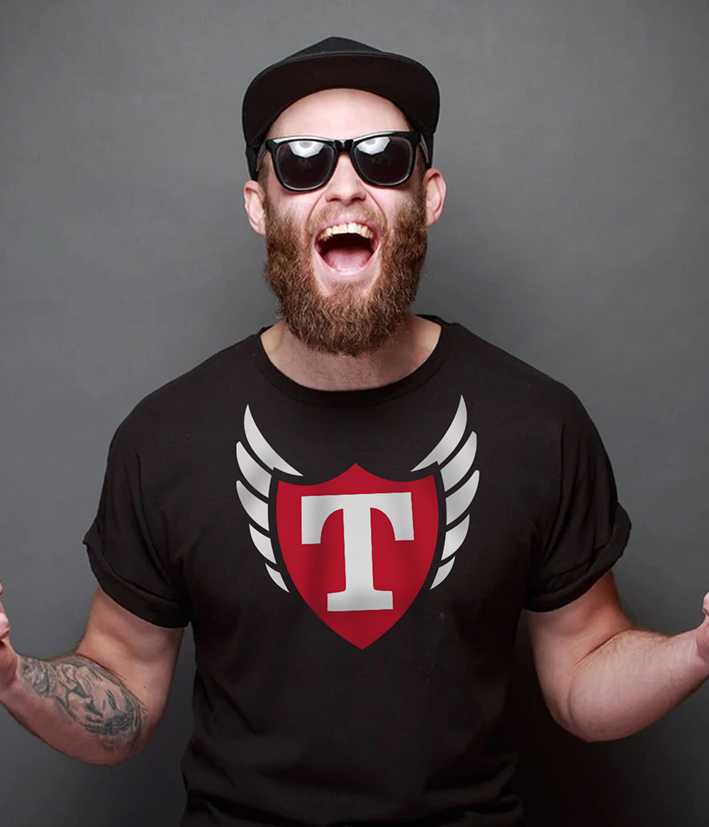
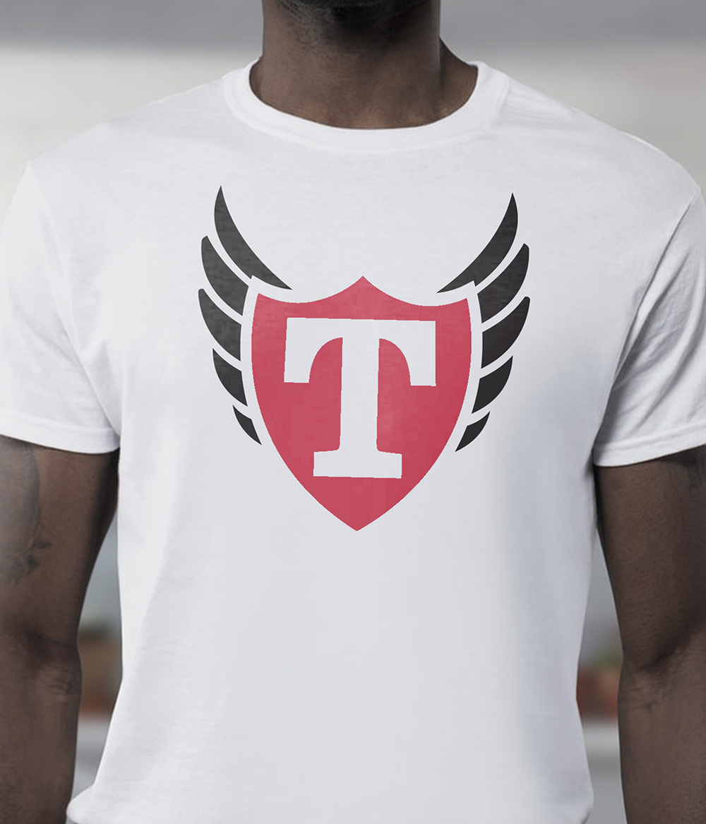
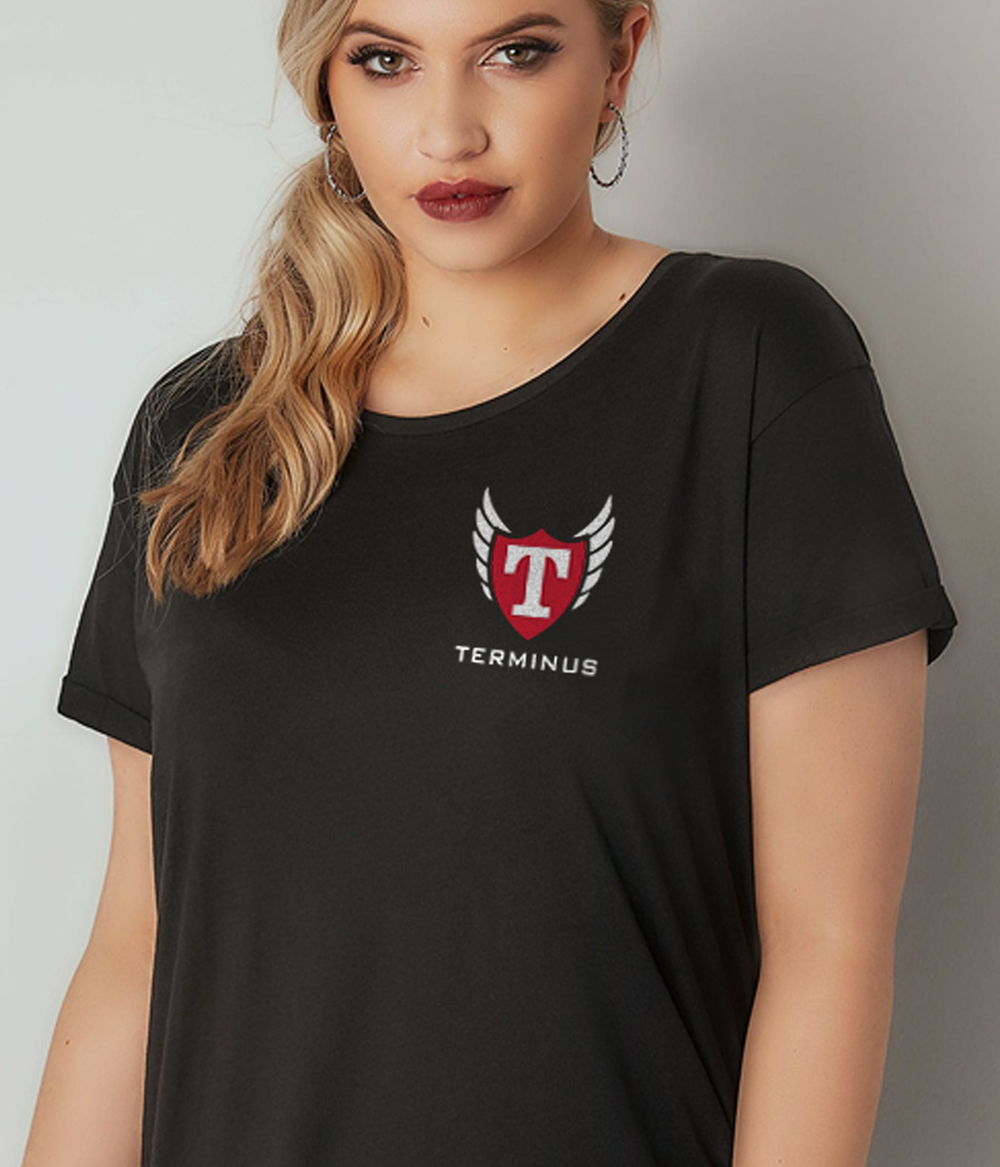
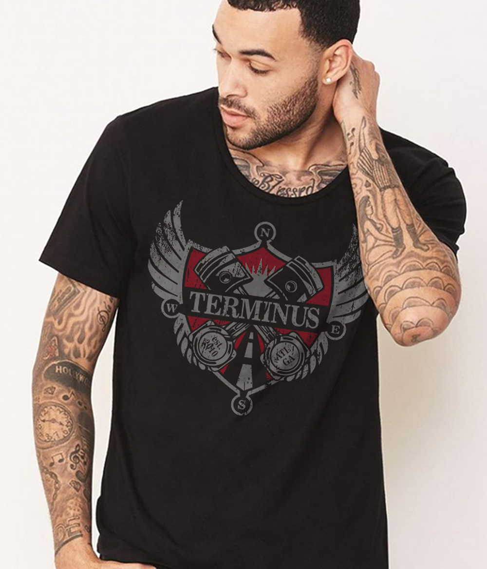
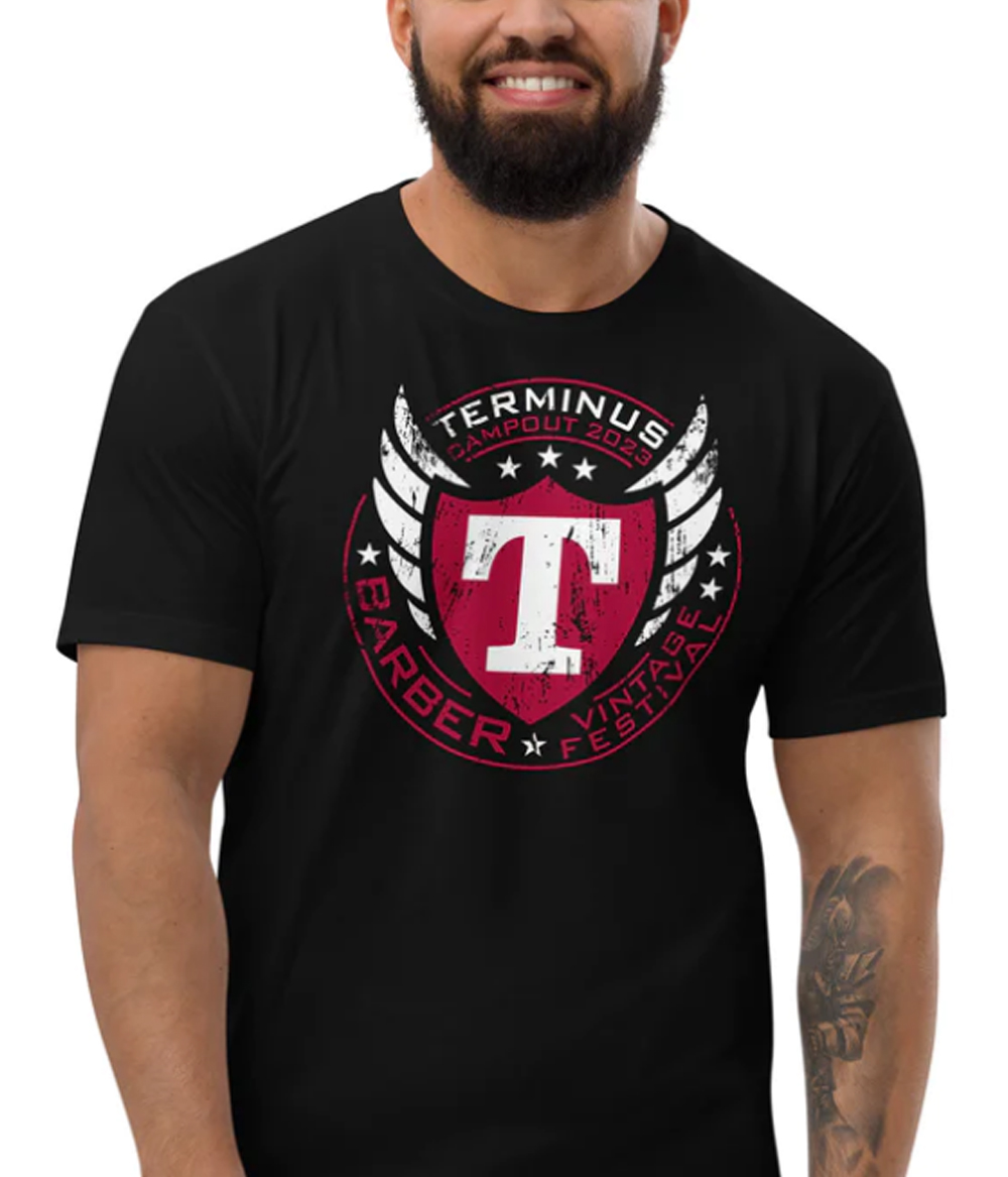
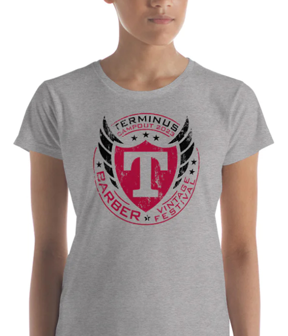
The TERMINUS brand connects with a diverse audience that shares a common passion, and uses symbolism which embodies that spirit.The Shield represents Strength. The strength of comradery.The Wings express Freedom. The freedom of the open road and escaping the stress of everyday life.The custom-made T, with its bold and sturdy stature, represents Family. The secondary logo, designed as a Family Crest, embodies more of the symbolism of the brand and its audience and is intended for less formal needs.This brand also works great represented clean or with a grungy feel, thus connecting with the diversity of the audience. With the simple contrasting color pallet, the brand works great using a single color or any combination of colors.The messaging is also simple but definitive. Expressing that everyone can participate because there are NO LEADERS. NO RULES.Below are additional logo versions. Promotional & Social Media Merchandising Apparel / T-Shirts Let's discuss your next project Let's Talk